Accessible by Design: How to Make Sure the Website You Build Actually Works for Disabled Visitors

A visually impaired person lands on your homepage, screen reader running, and hears “image, image, image, button, button.”
Someone who is using a keyboard rather than a mouse tries to book an appointment through your contact form and finds the focus jumping past the field they need. Neither may ever let you know why they left. They may simply close the tab, and you will never learn why.
This happens thousands of times a day. Scope, the disability equality charity, puts the number of disabled people in the UK at around 16 million, roughly a quarter of the population, using government Family Resources Survey data.
Ignoring that reality can leave disabled visitors facing unnecessary barriers, whether they’re trying to find information, book a service or make a purchase. It can also create accessibility and compliance problems that are far easier to prevent when access is considered from the start.
Accessibility needs to be considered before you pick a template, not after the website is finished. This piece covers what actually breaks a site for disabled visitors, what WCAG 2.2 AA means in practice, and how to check your own work once it’s live.
What Actually Breaks a Site for Disabled Visitors
Keyboard-only users, including people with tremor or limited dexterity and people who navigate without a mouse or touchscreen, tab through links, buttons and form fields in order. If a menu traps focus inside a dropdown, or a “skip to content” link doesn’t exist, they can be left pressing Tab dozens of times before reaching anything useful.
Screen reader users rely just as heavily on heading structure. Properly nested headings let someone jump straight to the section they want. Use headings purely for visual size instead of structure, and that shortcut disappears.
In one r/Blind discussion, an accessibility trainer gathered feedback from around 40 blind and low-vision screen reader users before a WordPress conference talk. Missing or misused headings came top of the list of frustrations, followed by problems including missing alt text and unlabelled form fields and buttons. Other disabled users highlighted poor contrast, websites that block zoom and the lack of “skip to content” links.
Alt text does similar work for images: a meaningful product photo with no description can become a dead end for someone using a screen reader. Low-vision and colour-blind visitors can also be affected by poor contrast. WCAG AA generally requires a contrast ratio of at least 4.5:1 for normal text, while pages also need to cope with text resizing without content becoming unusable.
We ran into another accessibility issue when an autistic member of our team found it difficult to know where to start when describing images. That experience led us to create a free image-description tool, designed to help people write useful alt text using good-practice guidance for blind and visually impaired users.
Deaf and hard-of-hearing visitors need captions for video and suitable alternatives for audio content. Autoplaying video, flashing content and some forms of motion can also create serious accessibility barriers, including for people with vestibular disorders or photosensitive epilepsy.
6 Website Barriers That Lose You Disabled Visitors
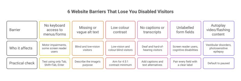
| Barrier | Who it can affect | Practical check |
|---|---|---|
| No keyboard access to menus or forms | People with motor impairments and some screen reader users | Test the whole site using only Tab, Shift+Tab and Enter |
| Missing or vague alt text | Blind and low-vision visitors | Describe the image’s purpose where the image conveys useful information |
| Low colour contrast | Low-vision and colour-blind visitors | Aim for at least 4.5:1 contrast for normal text |
| No captions or transcripts | Deaf and hard-of-hearing visitors | Add captions to video and suitable text alternatives for audio |
| Unlabelled form fields | Screen reader users and people with cognitive disabilities | Pair every field with a clear, correctly coded label |
| Autoplay video or flashing animation | People with vestibular disorders or photosensitive epilepsy | Default to paused and follow WCAG guidance on flashing content |
WCAG 2.2 AA in Plain English
WCAG, the Web Content Accessibility Guidelines, is an internationally recognised accessibility standard and is referenced in accessibility policies and regulations around the world. The current version, WCAG 2.2, was published by the W3C in October 2023 and has three conformance levels: A, AA and AAA.
For many organisations, WCAG 2.2 AA is a useful technical baseline. It covers areas including contrast, keyboard access, captions, resizable text, focus behaviour and clear labelling. The exact legal requirements depend on the organisation and jurisdiction, so meeting a WCAG level should not be treated as a substitute for checking the accessibility duties that apply to your organisation.
How to Test Website Builder Templates for Accessibility
Most people building their own site aren’t coding from scratch; they’re picking a theme inside a builder and filling in the blanks. That’s often where important accessibility decisions are made. A template with poor heading structure, inaccessible navigation or low-contrast defaults can carry those problems across every page you create.
When comparing a website builder, check whether its templates support keyboard navigation, properly structured headings, labelled forms, useful alt text and accessible colour choices rather than assuming accessibility is handled automatically.
Before committing to a platform, understanding what to look for in a website builder can also help you identify limitations that would be expensive or difficult to fix later.
There are real examples of why testing matters. One Squarespace user reported running the free WAVE accessibility checker on her website and finding “empty link” errors caused by the platform’s standard social-links block. According to her account on the Squarespace community forum, support told her that resolving the issue would require upgrading her plan and editing code. Experiences like this are a reminder to test the particular template and features you intend to use rather than relying on a platform name alone.
You can also turn on a free screen reader, such as NVDA on Windows or VoiceOver on Mac or iPhone, and try to complete your own contact form without using a mouse. If you encounter a barrier, investigate it rather than assuming a disabled visitor will be able to work around it.
Automated checkers can help identify some problems, but they don’t replace manual testing or feedback from disabled users. Accessibility also shouldn’t be treated as something that can simply be bolted onto an inaccessible website with a widget. In 2025, the US Federal Trade Commission took action against accessibility overlay provider accessiBe over claims that its automated product could make websites compliant with WCAG. The case is a US regulatory example rather than UK law, but it illustrates why automated tools should not replace fixing accessibility problems in the underlying website.
During the pandemic, we looked at how quickly assistive technology and everyday accessibility features were changing as more of life moved online. Our article on how assistive technology improved during the Covid-19 pandemic drew on feedback from the Disability Horizons community and covered changes including better speech-to-text tools, website accessibility, live captions and built-in accessibility features on phones and computers.
Accessibility Isn’t a Launch-Day Task
None of this is a one-off audit you complete and forget. Browsers update, plugins change and someone might add a new banner, form or video next quarter without rechecking it.
The European Accessibility Act, which began applying to many covered products and services in the EU from 28 June 2025, is another reason for businesses serving European customers to understand their accessibility responsibilities. Its application depends on the business, product or service involved, so organisations should check the rules relevant to them rather than assuming the Act automatically applies in the same way to every website.
Test important journeys with a keyboard and screen reader whenever the site changes. Automated tools can help find some errors, but testing with disabled users can uncover barriers that software misses. Accessibility works best when it becomes part of how a website is chosen, built, updated and tested, rather than something checked once on launch day.
Website Accessibility FAQs
What makes a website accessible for disabled people?
An accessible website allows disabled people to find information and complete tasks without unnecessary barriers. This includes keyboard-accessible menus and forms, clear heading structures, useful alt text, sufficient colour contrast, captions for video, labelled form fields and content that remains usable when text is resized.
What does WCAG 2.2 AA mean for a website?
WCAG 2.2 AA is a widely used accessibility standard covering areas such as keyboard access, colour contrast, captions, focus behaviour, text resizing and form labels. It provides a useful technical baseline, but organisations still need to check the accessibility and legal duties that apply to them.
How can I test whether my website is keyboard accessible?
Put your mouse aside and try to use the website with Tab, Shift+Tab and Enter. Check whether you can reach every important link, menu, button and form field, whether the focus order makes sense, and whether you can always see which element currently has keyboard focus.
Can an automated accessibility checker tell me if my website is accessible?
Automated checkers can identify some accessibility problems, but they cannot tell you whether every part of a website works well for disabled visitors. Manual keyboard and screen reader checks are still important, and testing with disabled people can identify barriers that automated tools miss.
Do all website images need alt text?
Images that communicate useful information need an appropriate text alternative so that people who cannot see the image can access its purpose or meaning. Decorative images should generally be handled differently so that screen reader users are not given unnecessary descriptions.
Should website accessibility be checked after every update?
Important user journeys should be checked whenever changes could affect accessibility. A new plugin, contact form, navigation menu, banner, video or template change can introduce barriers even if the website previously worked well. Regular testing makes accessibility part of maintaining the site rather than a one-off launch check.
